09/08/2020 - Sardegna, Italy
Good morning, Italy!
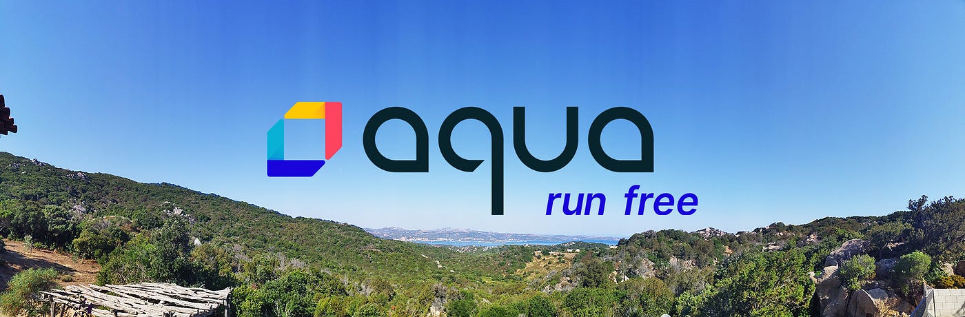
It’s early morning. I’m drinking my cappuccino and enjoying the endless view of Porto Cervo, surrounded by this green forest, naturally sculpted rocks of Sardegna, with the Mediterranean sea on the horizon, the melody of the grasshoppers, little breeze, and no clouds in the sky. This pastoral moment is inspiring and the perfect moment to relax and share with you the story of the new branding of Aqua Security.
Today marks exactly six months since I’ve been a part of Aqua Security, the leading cloud-native security company, and the challenge to join a company that is growing at the speed of light was really appealing.
I’ve known Aqua since day one, as they used to be our client at Inkod. Founded as ‘Scalock’ by Amir Jerbi and Dror Davidoff, the company had the vision to protect containers and development environments with a totally different and innovative approach. Being a part of the emerging trend in the world of DevOps, it had a huge potential to become the leader in the cloud-native security ecosystem.

Aqua Security is unique, and I’m inspired by our holistic vision and the fact that we are investing in the cybersecurity research and innovation with Aqua Nautilus Team, and also in the open-source solutions and community with the team led by Liz Rice, our VP Open Source Engineering.
As the market matured and the competitive landscape shifted, Aqua has evolved too. It became pretty clear that the need to rebrand the company was on the table.
Positioning and Messaging
The brand of Aqua Security was well-known, but the story has evolved quickly. The rebranding was a real opportunity to reflect our new positioning as the leader of this industry and convey our vision for the most complete cloud-native security platform.
The Complete Cloud Native Security Platform

To define the messaging and positioning of the company, we partnered with CXO, a communication and brand strategy firm located in Boston. The output of their research gave us the confidence to define ourselves as The Experts, and that we’ve earned the right to Be Bold and to differentiate ourselves this way from the competition since no other players in the market have the same full life-cycle solution built in-house from A to Z.
Security means Freedom
To illustrate our values, we had to think about a new tagline. After considering many options with CXO, we came up with “Run Free”.
- The Freedom to run anywhere, anytime
- The Freedom from friction (that slows you down)
- The Freedom from vendor lock-in
- The Freedom to run with minimal constraints
Run Free is more than a tagline, it is a Statement!
The A-Team
Dror and Amir, the founders of the company, both were totally involved in the process and defined a core team around the new branding who helped to make decisions quickly. This process was led by Rani Osnat, VP of Strategy and Product Marketing, and Andy Feit, VP GTM.
Shirley Frid, the Director for Web and Marketing Creative, was on-board, and working with her was like to have full access to the Wiki of the company. She has a rich knowledge of Aqua Security and was able to explain to me all the use cases and the impact of the new brand on different marketing channels and, most importantly, bring a lot of creativity into the conversation.
The task was beyond just creating a new logo — it was an opportunity to connect between the marketing and the product team and align all Aqua teams under one voice, one story, as part of the Fusion Experience philosophy.

Our first win was to make sure that both creative teams from marketing and product will collaborate to understand their mutual needs and communicate to enrich each other. And for that, we’ve branded ourselves The Creative Nomads.
Shirley Frid and the Marketing Creative Team: Taylor Sattler and Ronit Coulson were ready for this challenge, along with Maya Fidel, UX / UI Lead (Former LivePerson product design leader), Liat Citron, and Iren Ben-Sheetrit on the product side. The help also from extra design partners was necessary to nail the rebranding vision properly: Tal Tabakman & Itay Bizinyan from Studio Sunday for the website design implementation, Ido Zaifman, Figma Israel, who helped us with our design system.
His experience with R&D teams of integrating design system and his expertise with Figma, a powerful collaborative and prototype tool that he has helped me to implement also at Cybereason, made Ido the perfect member of the Aqua’s Creative A-Team. For documenting our design system, which is the responsibility of the Product UX/UI team, we used ZeroHeight — a tool that I highly recommend since it gives full creative style guide visibility across the entire organization which is critical for scalability.
The team is your key to success, so join forces wisely, make sure teammates complement each other, and involve everyone in the process of such a mission. Branding is a very sensitive area and has a strong impact on a company by defining its DNA. So make sure to Fuse Together.
Our Values & Visual Interpretation
We asked our customers what is the New Aqua for them, and, based on their answers and our values, we’ve defined how we need to look like, and much more importantly … what we are not! We faced the challenge of making IT / Cyber Security company look edgy in a new space (Cloud Native as defined by Gartner).

The inspirational mood board process just made us realize how much our ecosystem is very ‘cliché’. Most companies look the same, and no one really disrupts and innovates in this category. It was clear for Shirley and myself that we can come fresh to this conversation and electrify Aqua!
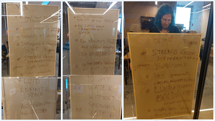
The visual inspiration process around our values helped us define a unique language and our brand guidelines, but it also was the opportunity to explore different directions and ideas, to Run Free.
Evolution VS. Revolution
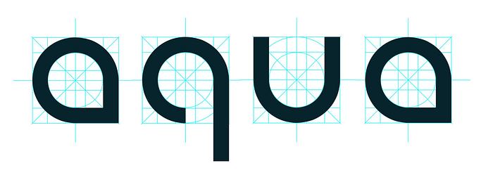
From sketches on the paper freestyle, I made a clear decision to create our own typeface.

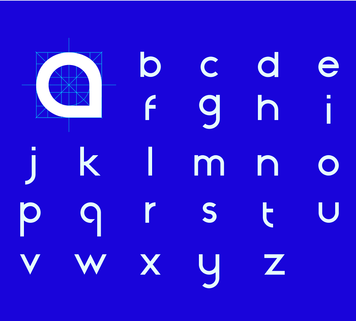
Aqua Droplet Typeface
I wanted to create a font that is fluid, cool, bold, and unique. It will help us bring together all our products and open source projects under the same look and feel. Besides, it offers the possibility to create in no time any new logos for the Aqua family in the future.
As part of our open source philosophy and to support the community, we are happy to offer Aqua Droplet font. Feel free to download it for free:
DOWNLOAD HERE
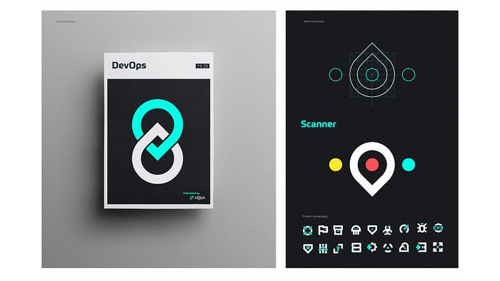
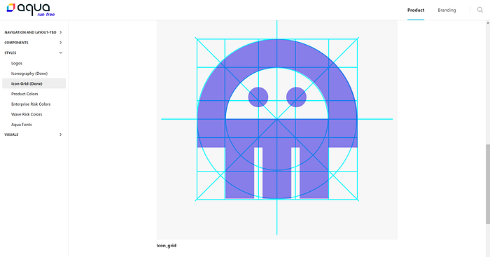
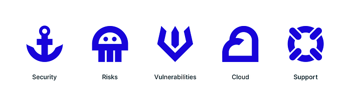
Aqua’s Icons Library
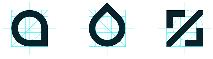
The letter A of the font was based on the idea of a drop and created with a solid grid that will allow us to play around, and to be able to create minimalist bold icons custom made for Aqua products.
Aqua Iconography Vision
The vision is to create the First Cloud Security Icons Library and to define the standard in our industry.

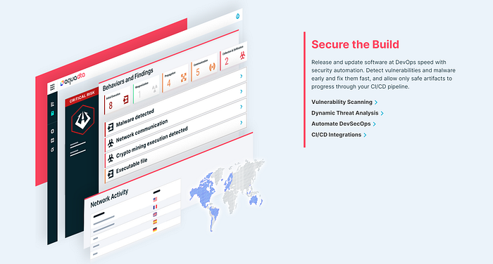
The icons are playful and are already being used cross channels and for many other purposes such as swag and events. We also leverage them to illustrate our three pillars of the holistic Cloud-Native Security Approach: Secure the Build, Secure the Infrastructure, and Secure the Workloads.
Logomark Exploration
Every designer from the Creative Nomads Team came up with several ideas around the logomark, and we brainstormed and explored different concepts. From the Trident (three pillars analogy) of Aqua Man to Birds and Ripples … endless were the possibilities since we were open to change the logo completely.
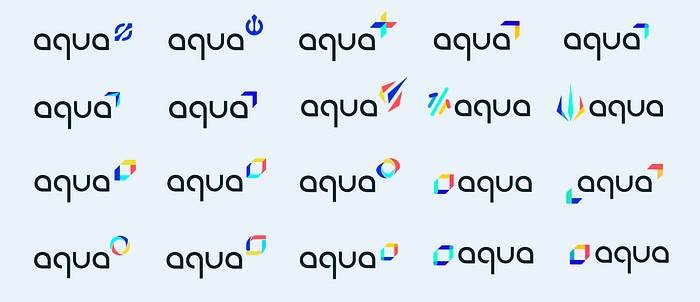
After exploring different directions, we’ve concluded that the actual logomark is so much connected to Aqua and is already familiar to everyone that it would be wrong to replace it, based also on our brand awareness marketing analysis. So finally, we ended up improving our current logomark of the two arrows by sharping the meaning of the colors and electrifying it to give the whole thing a fresh look and feel. The typeface we’ve created was strong enough to give the impact that we were looking for.
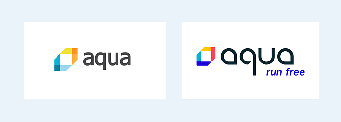
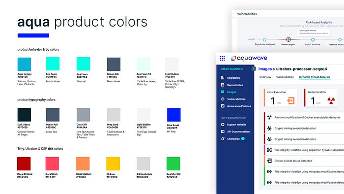
New Brand Colors
We’ve updated the brand book with electric bold colors and gave them unique names. The colors in our logo are Coral Red, Electric Starfish, Aqua legacy (same old blue), and Blue Royal which is our primary color. Each color represents our three pillars and conveys a deep meaning that we can develop further.

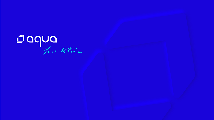
Blue Royal dedicated to Yves Klein
The Blue Royal came up following a deep competitive analysis research, and our desire to have an electric color that is strong and saturated. This unique color inspired by the French artist Yves Klein is a real statement that differentiates us from the competition and reflects our values. For sure, it hasn’t left anyone indifferent :) that was the purpose!
Klein created a subtle dimension inside the blue that has inspired us to play with the unseen and infinite space, just like vulnerabilities in the code we help you to discover. We have several elements in our imagery, such as our environment illustrations using Neumorphism subtly and elegantly to reflect our tagline concept: Run Free. The design is open and full of light to give you this feeling of accessibility. To twist it and make it unique, we highlighted a part of the illustration with neon to electrify our brand and called this specific style Neon-Morphism by Aqua.
From Yves Klein, Leonardo Da Vinci to Paul Klee and Maurits Cornelis Escher, Aqua’s brand and product design are inspired by several classic artists. The cocktail of tech with such references make our look and feel really unique.
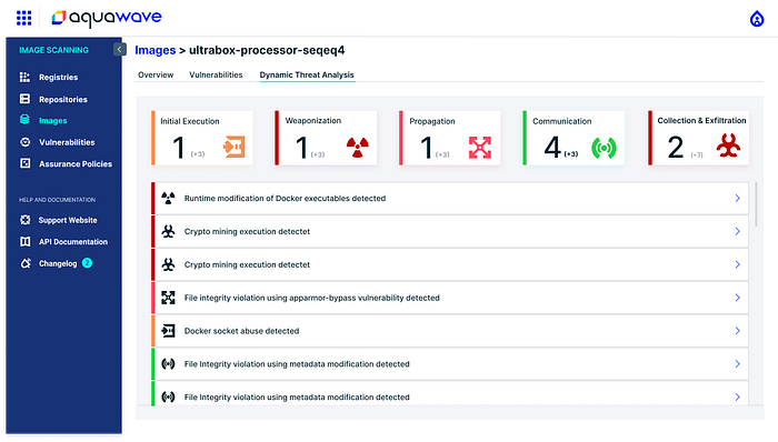
New Product Contextual Colors
On the product side, it was a huge opportunity to align our colors with all our platforms and to define for each color a very specific logic that is consistent and contextual. We sharped also the severity score colors and ensured that it works properly for AA — accessibility level.
Aqua’s New Tagline
The new tagline below the logo started with this “code” CLI concept,
but since developers and DevOps engineers are only part of our audience, we decided to write it in a much more minimalistic way, in italic and ‘outside the box’.

Welcome to Aqua Re-imagined
The new logo stands out now with a strong presence and reflects Aqua’s values, new positioning, and messaging. The brand was implemented first on our new website that was completely redesigned with the new structure and content to convey our story clearly. We defined then treatment for our visuals that were in perfect continuity with our new logo and revised our Markitecture to make it interactive. The presence of the product on the new website was fluid as part of our holistic vision.
Aqua’s New Website & Brand Implementation
The new website was launched successfully along with the brand. Our audience realized that we evolved and matured from a brand and positioning perspective. Following our rebranding, we’ve launched in parallel the new pitch presentation aligned with our new strategy and refreshed the design of the presentations. The flexibility of Aqua’s visual identity allows us to play cross channels on any platform, with a strong guideline that connects all the dots in a holistic way.
We are Aqua, we are Bold cloud-native security Experts!

There is a huge effort from the marketing team to update all online channels and kudos to Shirley and Tal for the new web presence. The new mega menu invites you to discover the world of Aqua and our new offering. Do not miss to visit our new website.
Many new job opportunities, so surf the wave and join the Aqua family :)
Markitecture & Infography
The more complex is your product, the more neat data visualization you will need. With the launch of the new branding and the holistic vision of Aqua, it was also a great opportunity to refresh the look and feel of our diagrams.

FX Product Design System
Our vision is to create a bold and sharp experience for our users by maintaining a consistent solution across all our products.
To fulfill our vision, Octopus was created to support design management at scale and to increase efficiency among UI/UX team and developers.

Octopus includes a collection of rules, constraints, and principles that are implemented in design and code, such as branding, look and feel, and experience.
The principles aim to be consistent and comprehensive but also to leave space for flexibility, creativity, and innovation.
Octopus is our asset library based on a platform called ZeroHeight, synchronized live with the Figma Prototype Design Collaborative tool, that offers us full visibility, consistency, and guidelines to serve cross channels as part of Fusion Experience philosophy.
Full UI alignment across all Aqua products
It was a huge effort from the R&D, PM & Product Management team to implement the new logical design system across all Aqua products and platforms. Thanks to your support, it was the key to success to make it happen in no time and get a great foundation.
Special Thanks to the UX & UI team and to Ido Zaifman for your support on Octopus Mission.

The product UI (User Interface) looks suddenly more logical, mature, consistent, and this coherent look and feel gives a lot of confidence, seamless on-boarding, and trust in our product. It’s more than product design, it’s accurate like our technology and works in symbiosis cross channels.
Special Thanks to Maya Fidel, Liat Citron, and Iren Ben Shitrit for
the fantastic new UX / UI product design and to all the PM and the great R&D team.
Aqua SWAG
We also believe that internal communication is crucial to align all the team members and to empower them. So we are very happy to present to you some cool SWAG that we’ve created for the launch of the new branding and our new office in Israel. It was a great opportunity to connect all the teams globally to our new story.
Tagline Versatility
From our Tagline “Run Free”, we have created a playful concept by adapting it to each use case of our brand communication: “Grow Free, Breathe Free, Chill Free, Stress Free, Bounce Free, etc.


And don’t forget to follow Aqua for more surprises!
Facebook + Twitter + LinkedIn + YouTube + Instagram + BeerSecOps + GitHub
Aqua Extra Goodies to celebrate our 5th-year Aquaversary!
Download your 5 Cloud-Native Security coolest icons + Aqua Droplet Font
Fusion Experience
The new Aqua brand was implemented successfully everywhere, from the new marketing visuals to our products redesign and other platforms (Aquademy, Community, Documentation, Training, etc.). We’ve also updated our social networks and sharpened our online presence along with our pitch, sales deck, and customer-facing presentations. We’ve received a lot of positive feedback and interest. Now we’re investing in integrations and powerful collaborations to complete our holistic solutions portfolio.
Just to summarize and get a perspective of the effort needed, in such a short timeline of six months nothing would have been possible if it was not planned properly, with the great teamwork and full support of the executive team.
Special Thanks to the Aqua’s Leadership Team.
Thanks to Lena Fuks for the text editing ;)
Follow Fusion Experience on Facebook, my book is coming very soon:
https://www.facebook.com/groups/fusionexperience

Feel free to listen to my latest interview with Dot Lung, The Mother of Social Dragons, who invited me to present Fusion Experience to the world.
https://www.instagram.com/tv/CF-Isb_JbHS/?igshid=pha2av405di
Aspire to inspire,
Ilan